AMP or the Accelerated mobile pages are a very important factor to skyrocket your organic traffic from mobile devices. It not only helps you to increase traffic to your Blogger blog but also makes your site load faster and that helps your visitors stay for a long time.
So, you might know that when you upgrade your blog’s theme to AMP version and while upgrading, this might affect your blog’s layout badly and sometimes you might have to reinstall another theme for your Blogger blog.
But today, I have come up with a solution that would not affect your current Blogger theme or your blog’s layout and will keep your responsive design as it is.
So, in order to create a separate AMP page on Blogger’s mobile URL (i.e. m-1), you need to have a valid AMP snippets codes added in your Blogger template and you just have to make minor changes for mobile devices URL (m-1).
Just follow the simple steps and you will be done within no time and have a responsive AMP page for your Blogger blog.
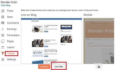
Step 1. Login to your Blogger blog and select Template and click on Edit HTML.
Step 2. When you are in your HTML editor, you will come up with the below code at the beginning of your Blogger template.
Code
<HTML expr:dir='data:blog.languageDirection' lang='id'>
Step 3. After locating the above code, replace it with the below code and this will make your Blogger template into a valid AMP template.
Code
<HTML expr:dir='data:blog.languageDirection' lang='id'>
<b:attr cond='data:blog.isMobileRequest == "true"' name='amp' value='amp'/>
When you finish the above two steps, save your settings and by saving you made an AMP page on the mobile URL (m-1). But you need not make any changes to your previous layout because these AMP elements would work fine on every device like on desktop, tablet or on any mobile devices as well.
But, you have to follow the below steps, in order to optimize your AdSense ad codes into AMP version. For this, you need not have to make any changes to your default AdSense ad codes for desktop screens because we have made AMP pages only for mobile versions. So,
Step 4. Search for the </head> tag and paste the below Ad code and this will optimize your AdSense Ads for mobile devices as well.
Code
<b:if cond='data:blog.pageType not in {"static_page","error_page"} and data:blog.isMobileRequest == "true" and not data:blog.searchQuery'>
<script async='async' custom-element='amp-ad' src='https://cdn.ampproject.org/v0/amp-ad-0.1.js'/>
</b:if>
<b:if cond='data:blog.pageType not in {"static_page","error_page"} and data:blog.isMobileRequest == "false" and not data:blog.searchQuery'>
<script async='async' src='//pagead2.googlesyndication.com/pagead/js/adsbygoogle.js'/>
<script>
//<![CDATA[
(adsbygoogle = window.adsbygoogle || []).push({
google_ad_client: "ca-pub-xxxxxxxxxx",
enable_page_level_ads: true
});
//]]>
</script>
</b:if>
Kindly Note: Replace the AdSense publisher ID that is bold (ca-pub-xxxxxxx) with your own AdSense publisher ID.
Step 5. Again search for the </head> tag and replace it with the below codes and adding this code will make your theme a valid AMP template.
Code
<script async='async' custom-element='amp-ad' src='https://cdn.ampproject.org/v0/amp-ad-0.1.js'/> </head><!--<head/>-->
Step 6. Now, in order to make your AMP page discoverable, you have to add the following code just below the <head> tag. Adding this code will allow Google to discover and index your AMP version of your current page. rel=amphtml is the standard version of rel=colonical.
Code
<link expr:href='data:blog.homepageUrl + "?m=1"' rel='amphtml'/>
So, with this simple and easy steps, you can create your responsive Blogger template into AMP version and that too without even touching your original blog design.
Enjoy! or if you have found any problem adding the AMP codes or have any suggestions, you may leave a comment below and I would be glad to help you.
Blogger , Tips and Tricks


